
How to Design Eye-Catching Posters for Your Auckland Business
Understanding Your Audience
Before diving into the design process, it’s crucial to understand your target audience. Consider who will be viewing your poster and what message you want to convey. Are you targeting young adults, families, or retirees? Knowing your audience will help you tailor the design to capture their attention effectively.
Researching the local culture and trends in Auckland can also provide insights into what resonates with the community. This understanding will guide your color choices, imagery, and overall design style.
Choosing the Right Colors and Fonts
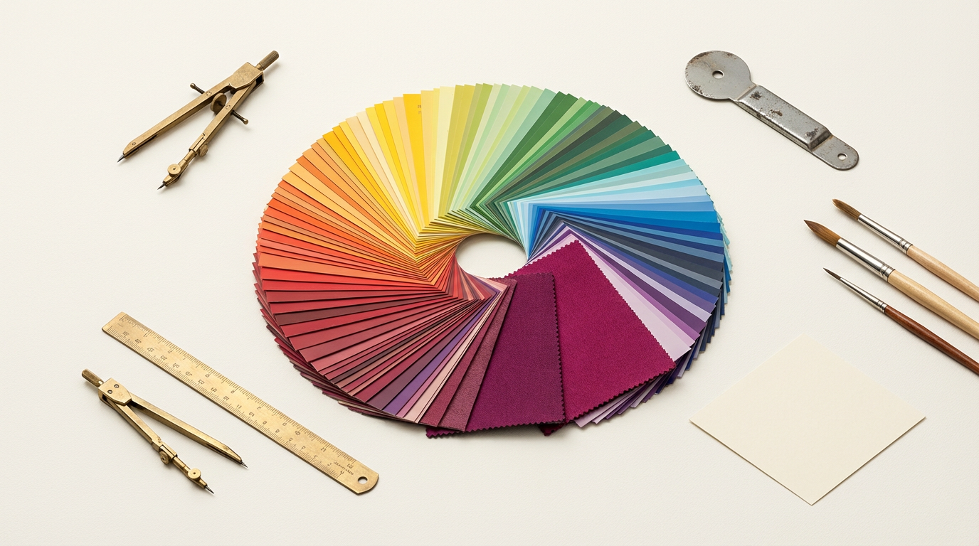
Color plays a significant role in grabbing attention and conveying emotions. Choose colors that align with your brand and the message you want to communicate. For instance, vibrant colors can evoke excitement, while softer tones might be more calming.
Fonts are equally important. Use bold, readable fonts for headlines and simpler ones for body text. Make sure the text is legible from a distance, as posters are often viewed from afar.
Contrast and Balance
Use contrast to make essential elements stand out. A well-balanced poster with a clear hierarchy will ensure that viewers can easily navigate the information presented.
Incorporating Imagery
Imagery can be a powerful tool to capture attention and communicate your message quickly. Use high-quality images that are relevant to your business and the message you are conveying. Images should complement the text and not overwhelm it.
Consider using local landmarks or cultural symbols in your designs to create a connection with the Auckland community. This can make your poster more relatable and engaging.

Crafting a Compelling Message
Your poster should convey a clear and concise message. Focus on your unique selling proposition and what makes your business stand out. Use compelling headlines and persuasive language to engage your audience.
Remember to include a call-to-action (CTA). Whether it’s visiting your website, attending an event, or making a purchase, guide your audience on the next steps to take.
Utilizing White Space
White space, or negative space, refers to the empty areas in your design. It helps to prevent your poster from looking cluttered and makes it easier for viewers to focus on the key elements.
Strategically use white space to highlight important information and create a clean, professional appearance. This can enhance readability and make your design more appealing.
Testing and Feedback
Once your design is complete, test it with a small audience or gather feedback from colleagues. This can provide valuable insights into how your poster is perceived and whether the message is clear.
Make any necessary adjustments based on the feedback received. This iterative process will help you refine your design and ensure that it effectively communicates your intended message.
Printing and Placement
Choose a high-quality printer to ensure your poster looks professional. Consider the paper type and finish, as these can affect the overall appearance and durability of your poster.
Finally, think about where you will place your posters. High-traffic areas in Auckland, such as shopping centers or community boards, can increase visibility and reach your target audience more effectively.