
How to Design Eye-Catching Posters for Auckland Events
The Importance of Eye-Catching Posters
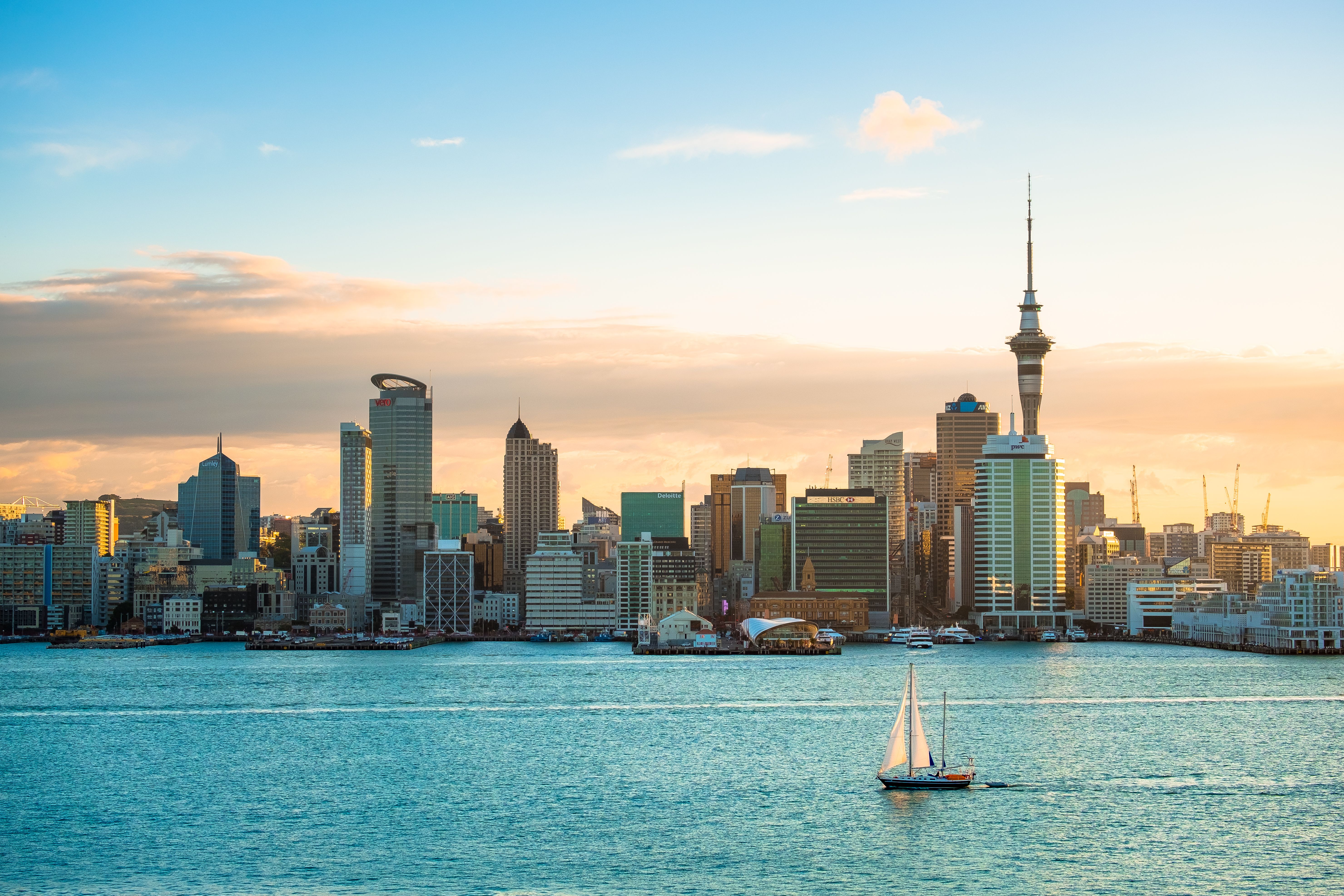
In a bustling city like Auckland, where events are constantly taking place, having an eye-catching poster can make all the difference in attracting attention. Whether it’s a music festival, art exhibition, or community gathering, a well-designed poster can grab the interest of passersby and compel them to learn more about your event. Visual appeal is crucial in standing out among the plethora of advertisements people encounter daily.
Understanding Your Audience
Before diving into the design process, it’s essential to understand who your target audience is. Are you aiming to attract young adults, families, or professionals? This demographic information will guide your design choices such as color schemes, fonts, and imagery. For instance, a family-friendly event might use bright colors and playful fonts, whereas a corporate event might favor a more sophisticated and minimalistic approach.
Research and Inspiration
Take time to research and gather inspiration from successful poster designs. Look at what other event organizers in Auckland are doing and consider what makes their posters effective. Keep an eye on trends in graphic design but remember that timeless elements often have the most enduring impact. Create a mood board of colors, fonts, and images that resonate with your event's theme.

Key Elements of an Effective Poster
An effective poster communicates its message quickly and clearly. Start with a strong headline that captures the essence of your event. This could be the event name or a catchy tagline. Use contrasting colors to ensure text is legible from a distance. The event details such as date, time, location, and ticket information should be prominently displayed.
Visual Hierarchy
Visual hierarchy is crucial in guiding the viewer's eye through the information on your poster. Use size and placement to highlight the most important details first. Typically, the event name or headline should be the largest text on the poster, followed by essential details like date and location.

Choosing the Right Imagery
The imagery used in your poster should be both relevant and engaging. High-quality images or illustrations can convey the mood and atmosphere of your event. If possible, use original images from previous events or hire a photographer to capture compelling shots that can be used in your design. Avoid cluttering the poster with too many images; sometimes, less is more.
Typography Matters
Choosing the right fonts is crucial for an eye-catching poster. Limit your design to two or three complementary fonts to maintain a clean and professional appearance. Ensure that all text is readable from a reasonable distance; sans-serif fonts are often a good choice for this purpose. Be mindful of alignment and spacing to maintain visual harmony throughout the design.
Color Psychology
Colors have a powerful impact on human emotions and can influence how people perceive your event. Choose colors that align with the theme and purpose of your event. For example, blues and greens can convey calmness and trustworthiness, while reds and oranges are more energetic and attention-grabbing. Ensure that your color choices enhance readability rather than detract from it.

Feedback and Final Adjustments
Once you have a draft of your poster, seek feedback from colleagues or potential attendees to gauge their initial impressions. Constructive criticism can help you refine your design before it goes to print or is shared online. Pay attention to details such as alignment, spelling, and any potential legal requirements related to event promotions.
With these tips in mind, you'll be well on your way to creating eye-catching posters that effectively promote your Auckland events. Remember that a thoughtful design not only attracts attention but also communicates your message clearly and inspires action.